
01Brief
A retail brand that earns belonging
Gopal's Nest is a lifestyle retail concept — home essentials, affordable decor, storage, kitchen, and gifting — designed to feel warmer and more curated than the discount stores it competes with. The brief was not simply to look premium; it was to make an affordable brand feel emotionally engaging — an identity people remember, not just a logo people recognize.
We approached the project as a complete brand system: strategy, naming story, logo system, color, typography, visual language, packaging, and guidelines — all designed to scale from shelf to storefront to digital.
02Opportunity
The gap between affordable and cheap
Experiences over products
Retail loyalty is built in the feeling of the store, not the price tag alone.
Affordable ≠ cheap
Discount positioning fails when visual language reads cluttered or generic.
Clutter is the default
Most home-retail identities compete on noise — not recall or warmth.
Loyalty is emotional
Customers return to brands that feel like home, not just brands that feel like deals.
03Strategy
Naming the feeling of home
We positioned Gopal's Nest as a welcoming neighborhood lifestyle destination — affordable without looking cheap, rooted in Indian familiarity, and modern enough to travel across packaging, signage, and digital touchpoints.
The name came before the mark. Every visual decision needed a reason rooted in trust, home, and belonging — not decoration for its own sake.
- Gopal
- Trust, Indian familiarity, community
- Nest
- Home, comfort, belonging
04Identity
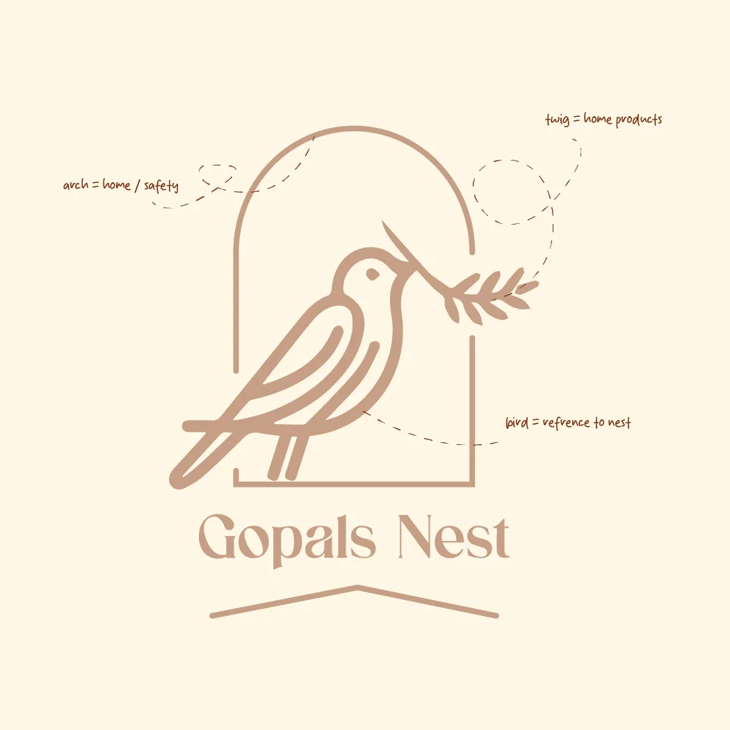
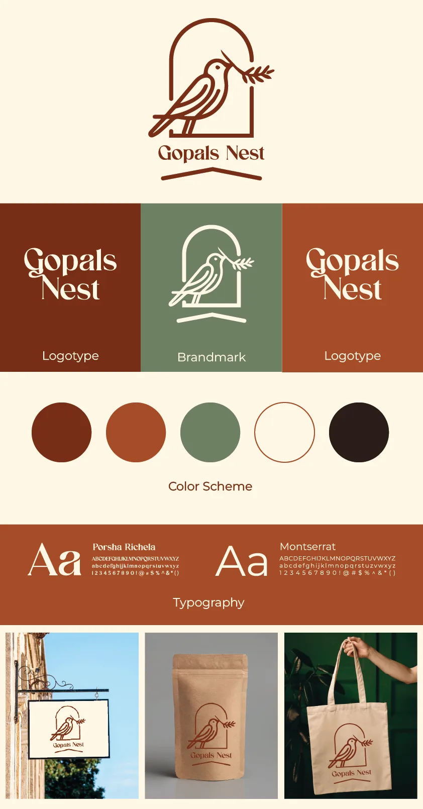
One mark, three meanings


05Color & type
Warmth you can scale
Display — editorial warmth
Making every house feel more like home.
Playfair Display · serif
Body — modern clarity
Affordable essentials, curated with care for everyday living.
Montserrat · sans-serif
06Applications
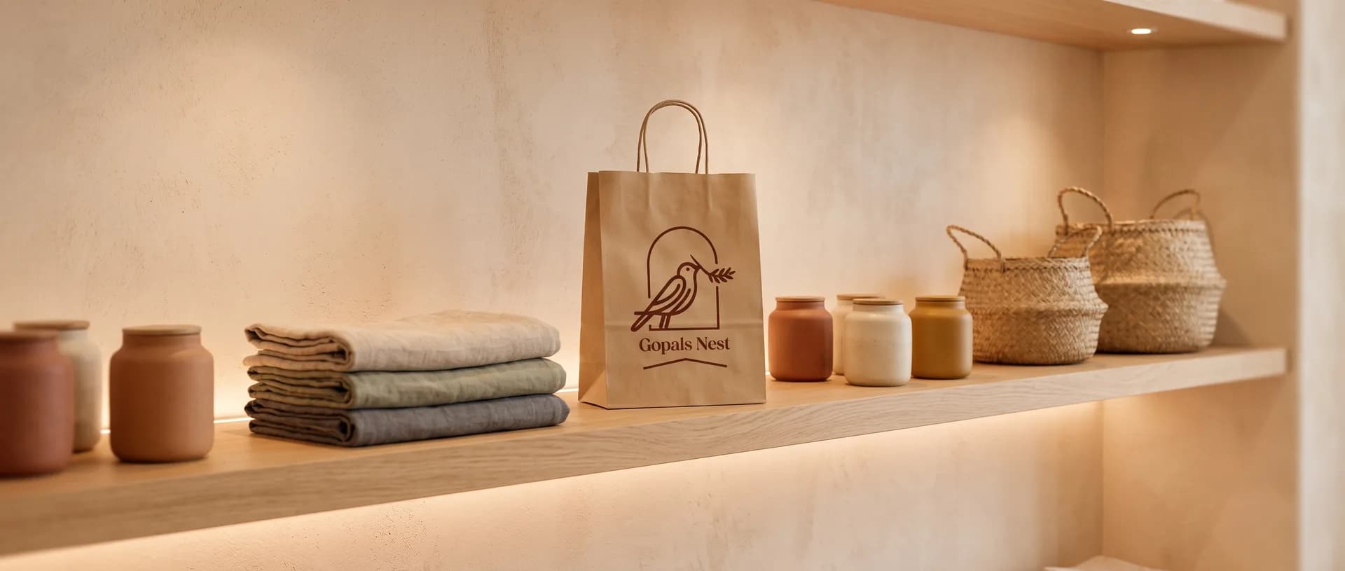
From guidelines to shelf
07Outcome
Built to roll out
- A complete, scalable identity system — primary and secondary logos, brandmark, mono and responsive versions with usage rules.
- A visual language that separates the brand from discount-store clutter while staying production-practical.
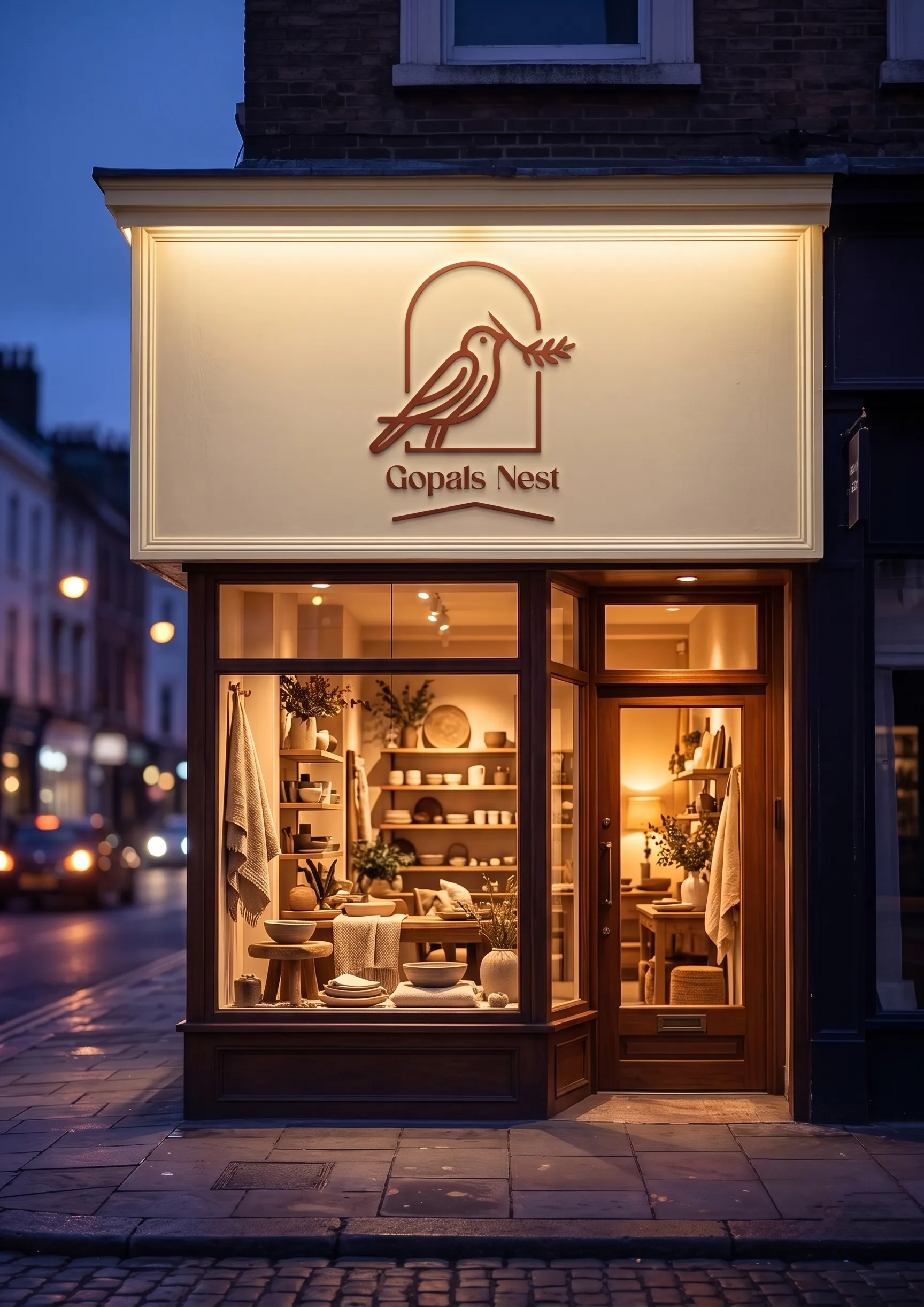
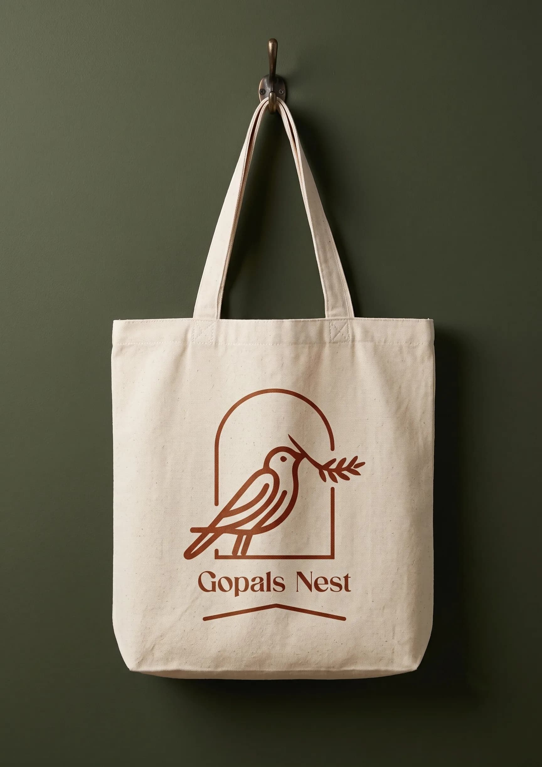
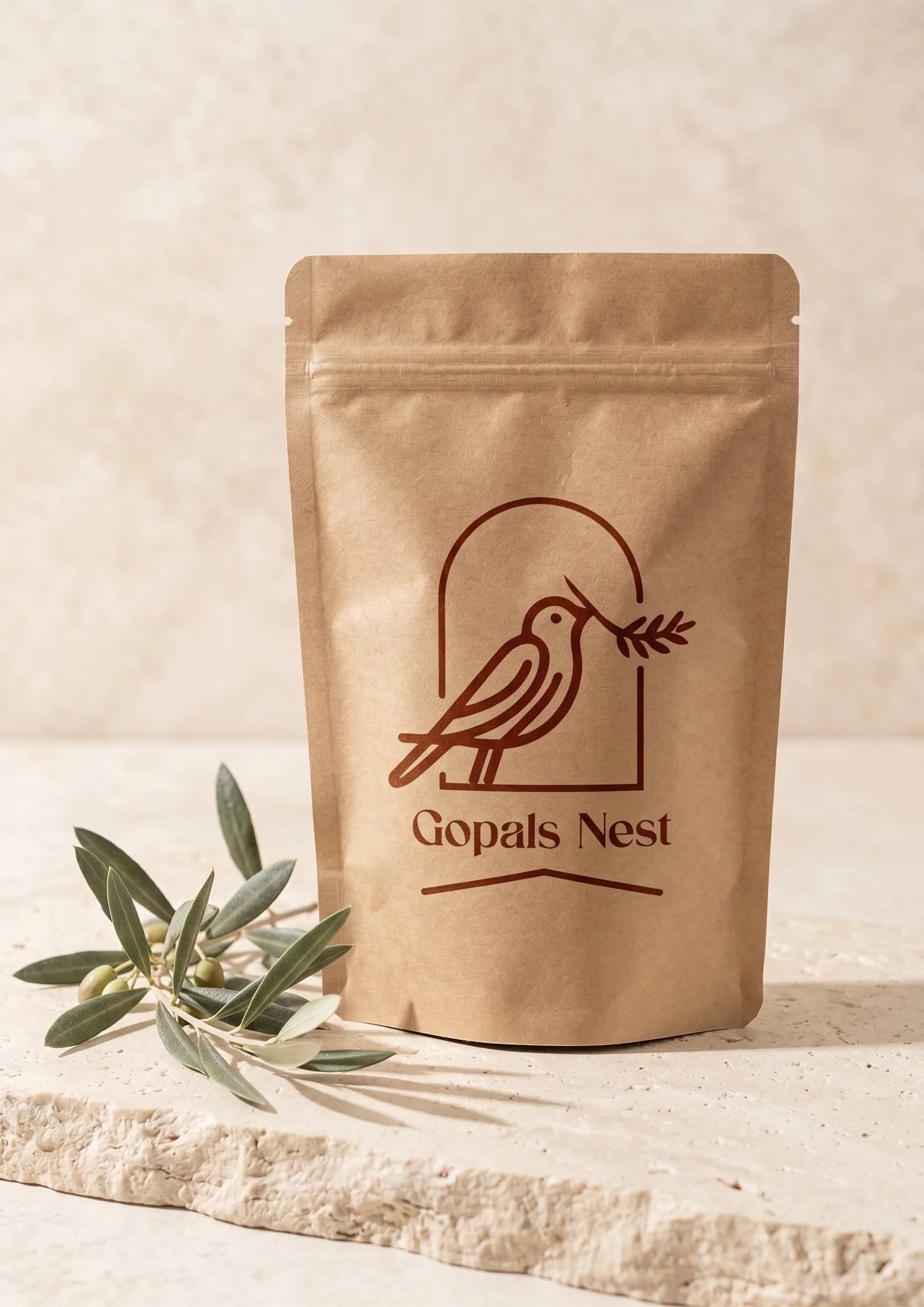
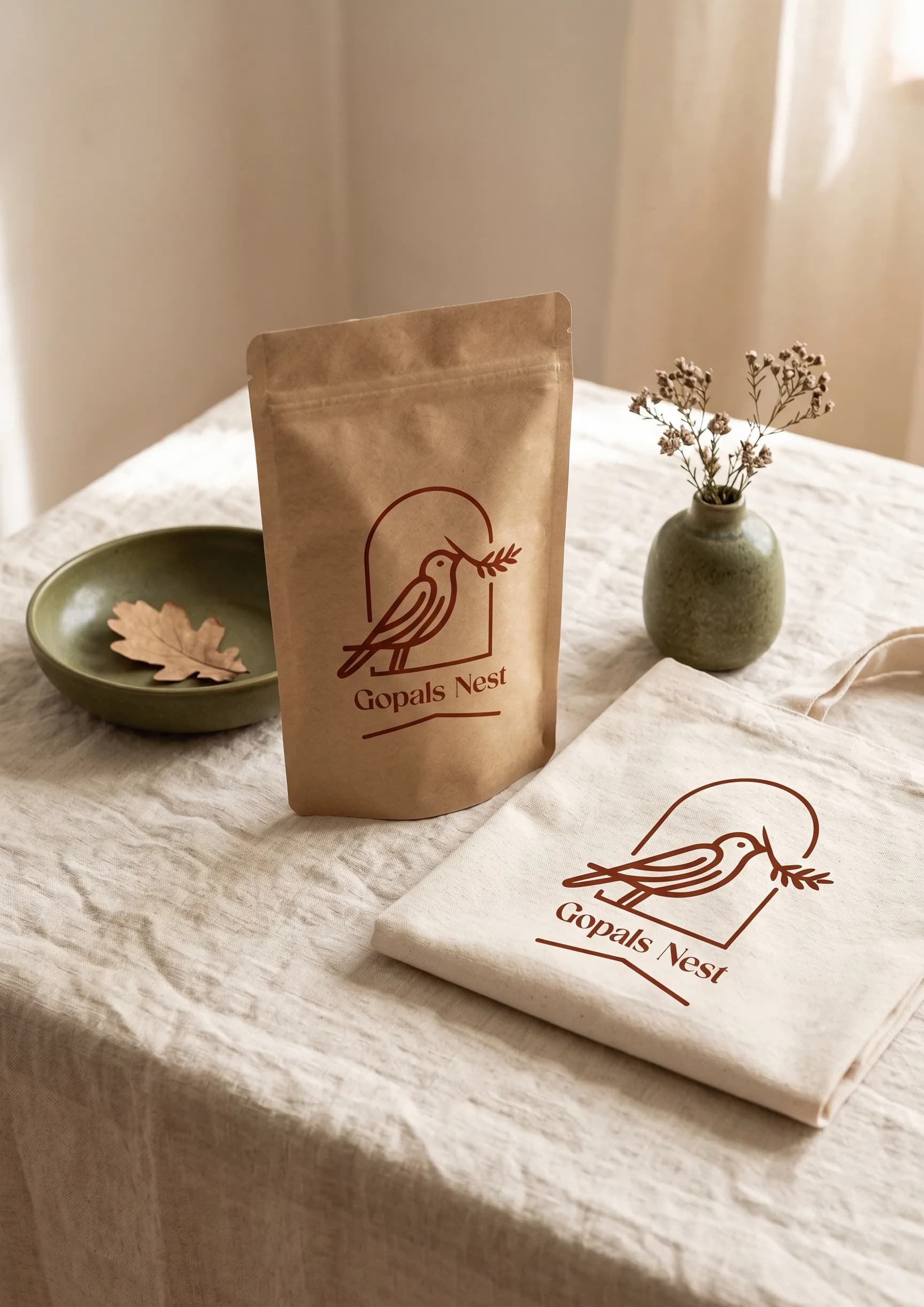
- Packaging, signage, and merchandise applications ready for retail rollout.
- A guidelines foundation any future vendor or team can execute consistently.
Affordable brands earn premium perception through consistency, not price. This identity was structured to build recall and rollout confidence — designed as a concept project with production-practical applications.
Outcomes above describe design intent for a concept engagement — not shipped retail metrics.